The situation
Blokes sits on the Passeig Marítim in Platja d'Aro, with the sea right in front of the terrace. The guests are Spanish, Catalan, Dutch, French and English, and they all arrive at different hours: coffee in the morning, plates off the charcoal grill in the afternoon, cocktails when the sky turns. The restaurant already had a brand worth keeping, from hand-cut lettering to a set of hand-drawn icons. It needed a site that felt like standing on that terrace, not like a template.
The website
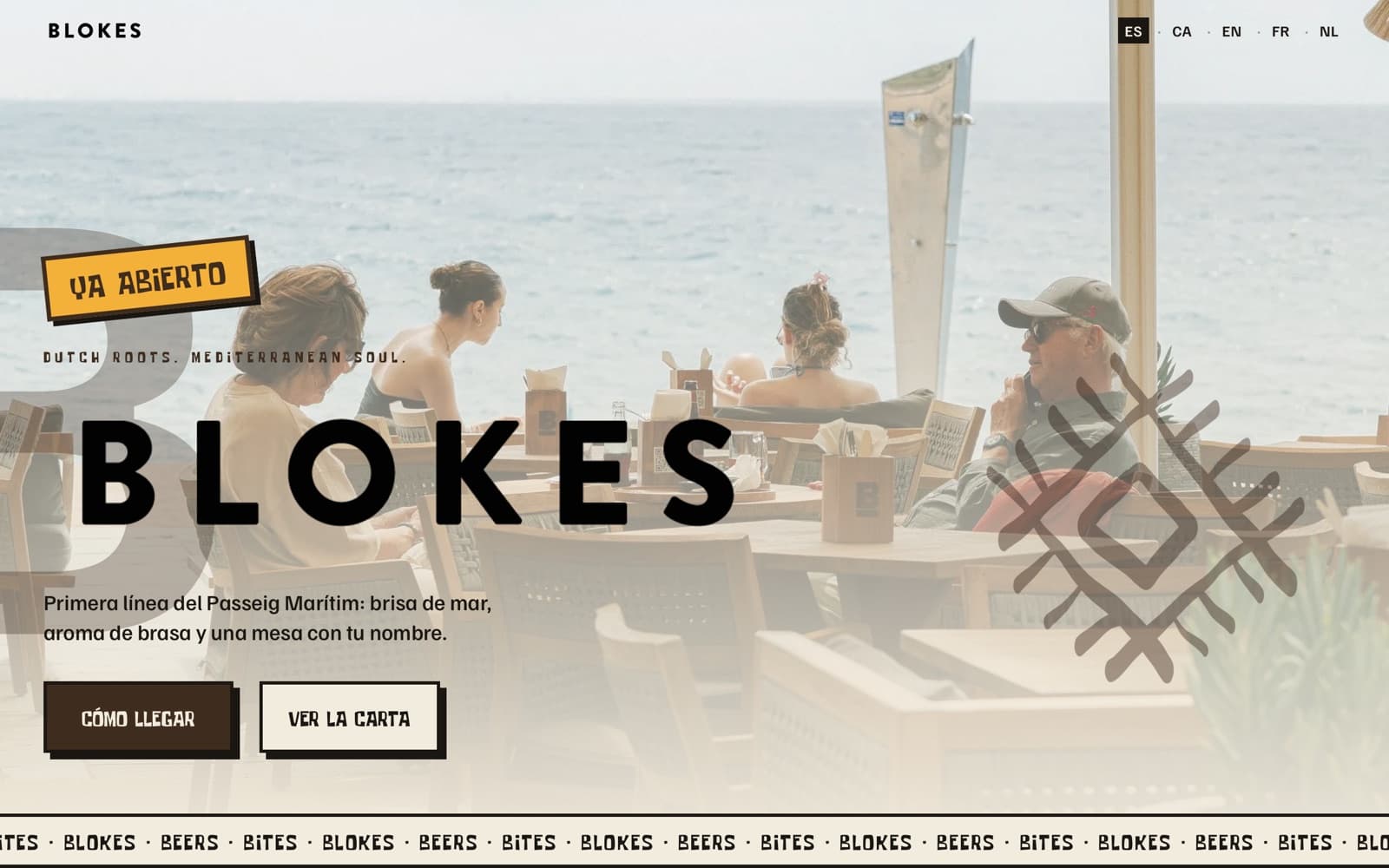
The brand, as delivered. Hand-cut titles, a wide geometric type for buttons and numbers, and a plain body face. Their ten hand-drawn icons sit in the menu list and the footer. The colours come from the place itself: sand, dune, espresso, and a warm sun yellow for the stamp.
One page, one day. The site walks through the day hour by hour: coffee, brunch, plates off the charcoal, a bucket of beers, fish and meat from the grill, cocktails. A small sun travels along the timeline as you scroll, and on a phone the steps are cards you swipe through. Each step has its own photo.
Open, so it says so. A yellow stamp tells you the doors are open. There is no booking flow, because the restaurant works on walk-ins: the two buttons on top are how to get there and the menu. Further down a Visit us block gives the address, opening hours and directions.
The real menus. Food, drinks and the happy-hour card are the restaurant's own PDFs, one tap away on a phone. When the drinks menu changed, we replaced the file and updated the highlights on the page to match.
Five languages
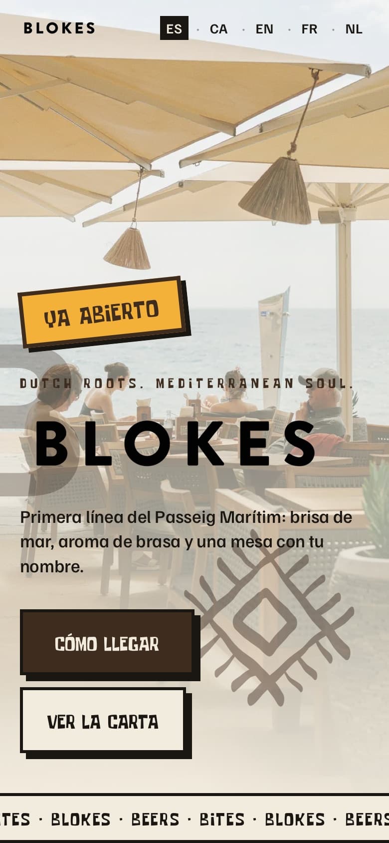
Spanish, Catalan, English, French and Dutch, each on its own address, written for that guest and not run through a translator. The site opens in Spanish and the guest switches in the top corner. The Dutch text reads the way a Dutch guest would say it.
Details that matter on a beach
- A map that opens Google Maps. The map card shows the exact spot and a tap takes the guest to directions in their own app.
- Instagram, with consent. The feed shows the latest posts only after the guest has said yes to cookies, and falls back to the restaurant's own photos if they say no.
- A sunset clock. The page shows when the sun goes down that day. The terrace faces east, so the copy talks about the glowing evening sky and not the sun dropping into the sea.
- Legal pages and cookies in order. Legal notice, privacy and cookie pages with the company's real details, and a cookie banner that stores the choice.
- A page for the table QR code. A short, quiet page for the QR stickers on the tables: the three menus as big buttons, directions, Instagram and the language switch. It opens in the guest's own language and is kept out of Google on purpose, so it is only reachable from the table.
Getting found
Every language has its own page with its own title and description, and the pages tell Google which version belongs to which language. The restaurant's details (address, opening hours, no reservations) are in a form Google reads, so the search result matches what the guest finds at the door.
What changed for them
Guests see within a second that Blokes is open, where it is and what is on the menu, in a language they read. The restaurant doesn't have to answer the same question about opening hours or the menu twice. And the site looks like Blokes, not like a booking platform.
What we keep doing
Menus and highlights change with the season, and we update them on the site when the restaurant sends the new cards. We keep the site running, hosted and up to date, and look at what Google shows for the restaurant's name and the town.
 Visit the siteblokes.es