The situation
Demi and Mandy are Dutch, live in Spain and teach other Dutch speakers Spanish. Not for an exam, but for everyday life: a chat with the neighbours, a doctor's appointment, the children's school. Their students learn online at their own pace and practise live in small groups on top of that.
Most visitors come from Instagram. They already know Demi and Mandy a little, but don't yet know which course suits them. The old site was a handful of pages and barely showed what was on offer. Anyone who wanted to start had to send a message first.
The website
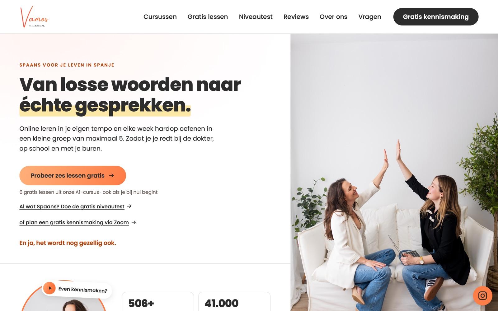
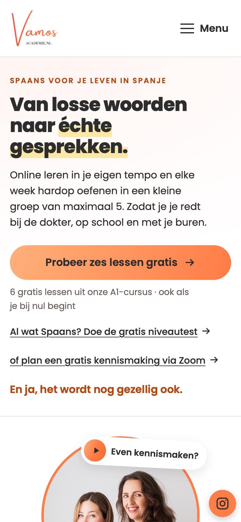
Three ways to start for free. Complete beginners try six lessons from the A1 course. People who already speak some Spanish take the level test. And anyone who would rather talk first books an intro call on Zoom. The homepage puts all three right under each other.
Every course on one page. At the top sits a short chooser: do you want to start right now, are you going on holiday soon, do you want to speak live as well, or do you know the basics already? Each answer jumps to the matching course, with the times, the teacher and a review from someone who took it.
Demi and Mandy, not stock photos. Their own photos and videos come first: a welcome video, and a tour of the online learning space under the heading ‘Kijk mee in de cursus’ (take a look inside the course). We blurred students' names and messages in that video.
In their own words. The copy, the FAQ and the reviews come from Demi and Mandy. We put them in the right place, shortened them where that helped, and showed them every change first.
Close to their own brand. Coral and orange from their logo, no bright red, rounded buttons. One small touch: hover over a button and its text switches to Spanish.
The level test
Fifteen questions, three answers each, about five minutes. Mandy wrote the questions, building up from A1 to A2. The result shows on screen straight away, together with the course that fits. You don't need to sign up to take it.
Free lessons and reviews
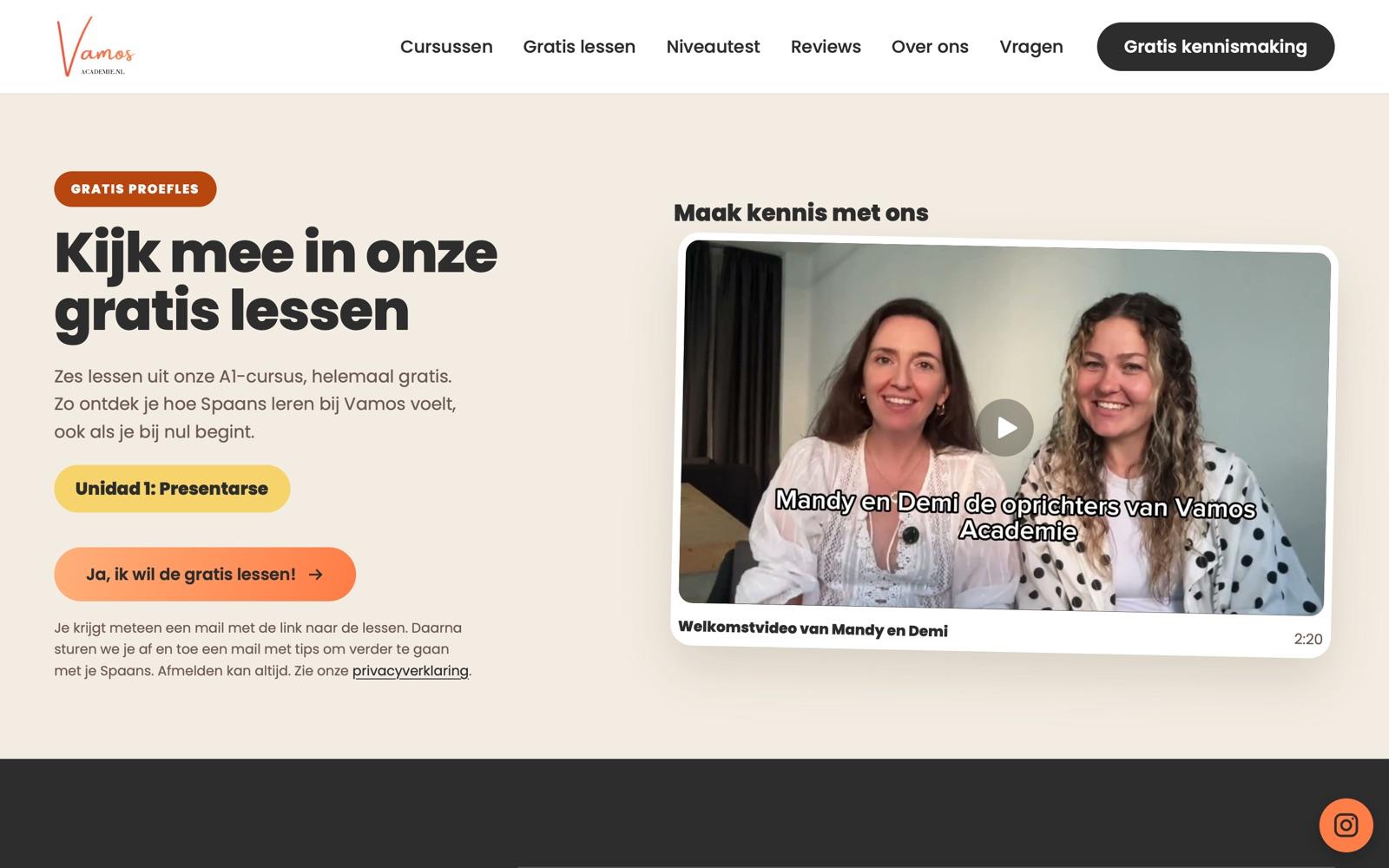
A page of its own for the free lessons. It shows what you get: the lessons, the workbook and a video from the course. The sign-up itself runs through the form Vamos manages themselves.
Reviews you can actually read. A row of real student reviews slides by on the homepage, shared with the students' permission. It stops when you point at it, has a pause button, and stays still for anyone who prefers less motion. Photos of children are blurred.
Properly sorted
- No cookie banner needed. The site doesn't track visitors and loads nothing from third parties; even the fonts are served from its own server.
- The terms are right at checkout. Every payment link now carries a line about the terms and the cooling-off period. Where their legal texts didn't match what the site does, we listed it for their lawyer instead of rewriting it ourselves.
- Tested on every screen. Every page was checked on phone, tablet and desktop, and with a keyboard alone.
Getting found
- On their own domain. The new site replaced the old one on vamosacademie.nl, the address visitors already knew.
- Old addresses forward. Links to pages on the old site land on the right new page, not on an error.
- Google knows what it is. The school and the FAQ are described in a way search engines can read, and every page is in a sitemap.
- A preview image. A link shared on WhatsApp or Instagram shows the brand instead of a blank box.
What changed for them
Demi and Mandy have a site they can send in a DM, and it answers the questions they would otherwise answer themselves every week. A visitor who is unsure has three free ways to start, and someone who already knows what they want finds the course and the payment link without searching.
What we keep doing
Hosting, updates and changes run on a fixed monthly fee. There is no content system to learn: Demi and Mandy send a message and we make the change. And we keep an eye on how the site gets found.
 Visit the sitevamosacademie.nl